Defining the message
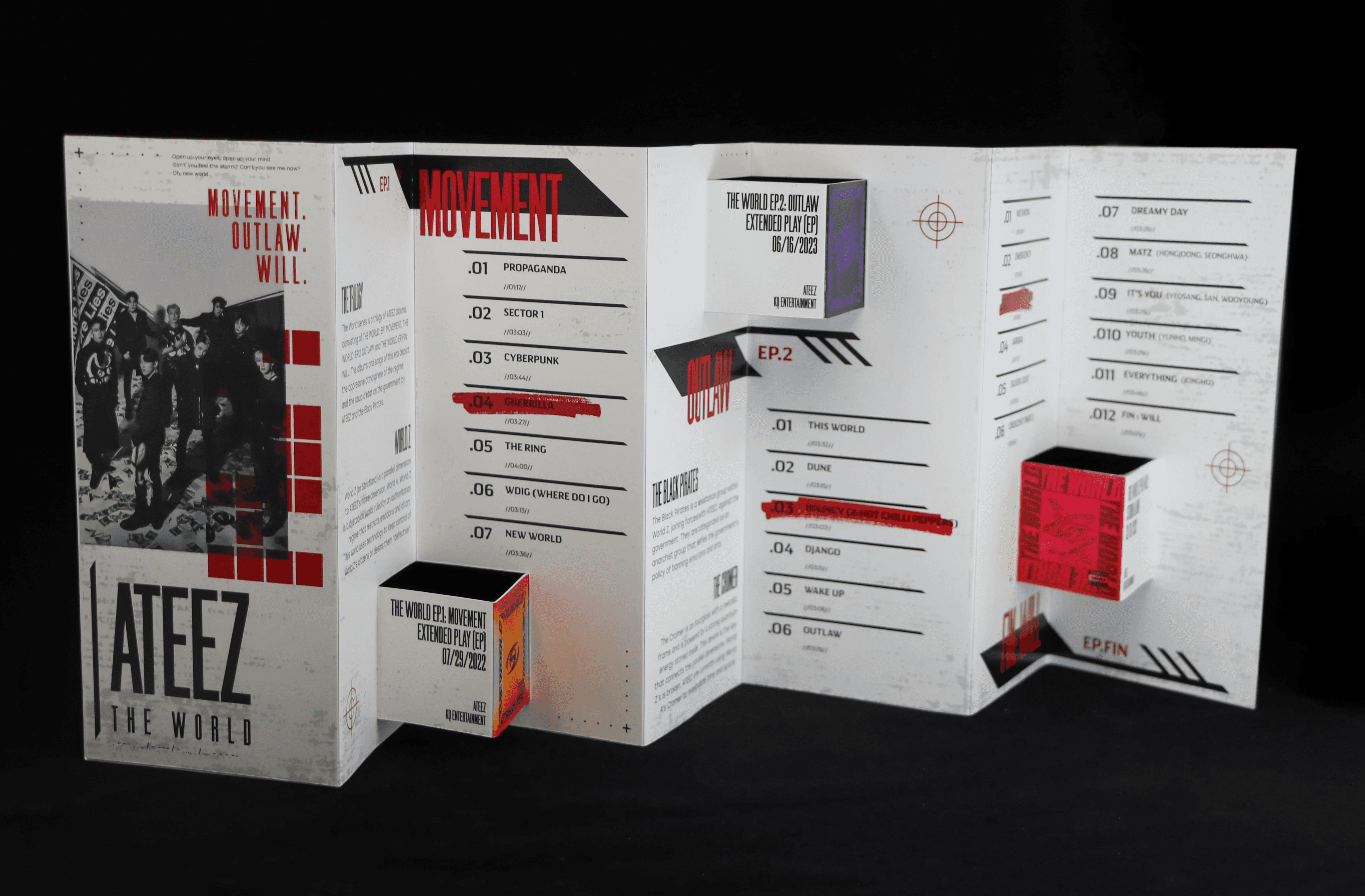
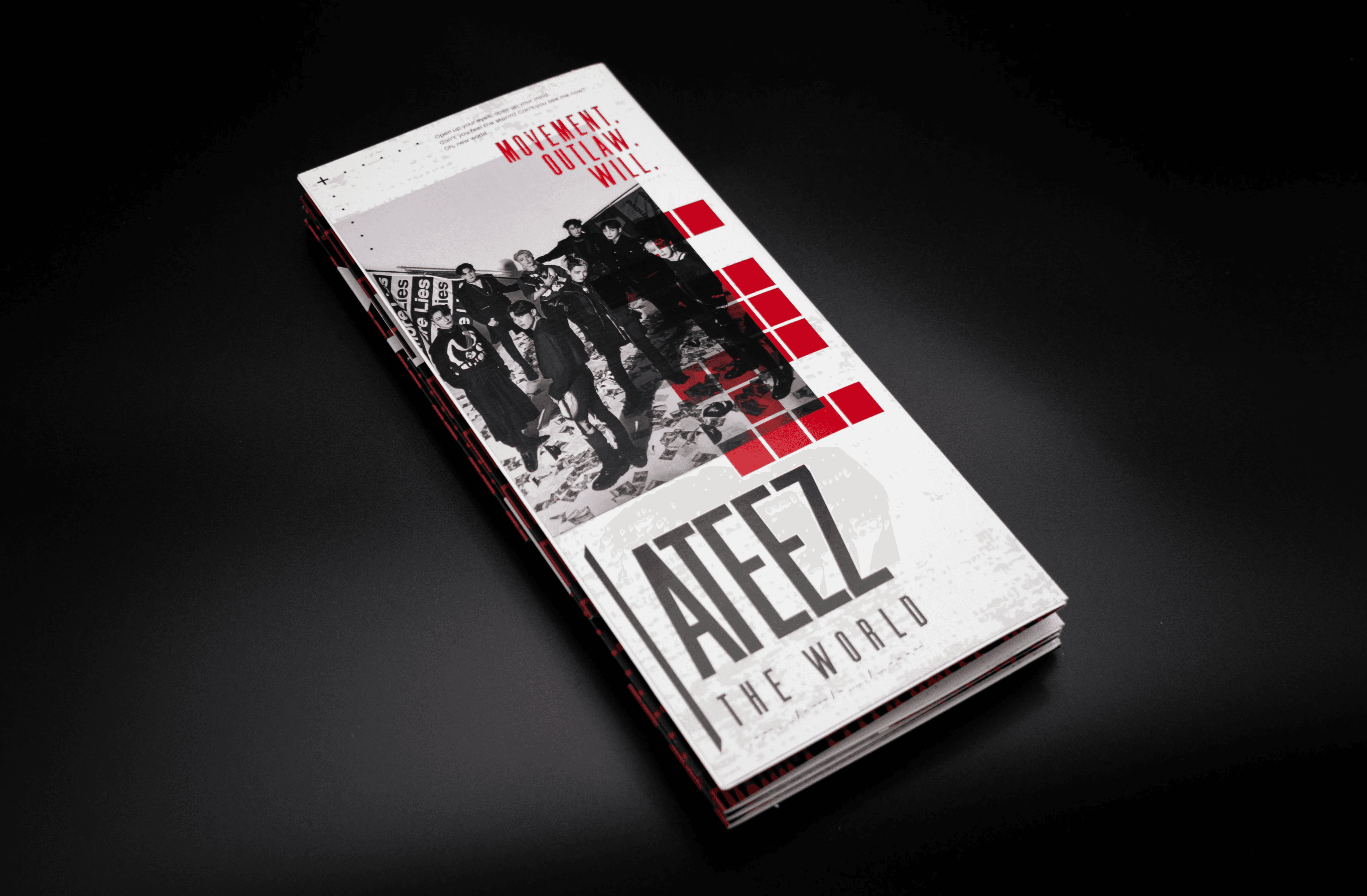
K-POP boy band ATEEZ characterizes their album trilogy, The World, through themes of authority, surveillance, and resistance. The group's lore in this era conveys the importance of using art and our voices to challenge oppressive systems. To introduce new listeners to this album trilogy, I designed a 10" x 31.5", accordion-fold brochure that explains important elements of this era and tracklists from each album that are critical to unfolding the story.
Translating sound into a visual
Beginning with research of the band's lore and marketing, I refined a concept that aligned with the trilogy's core values. The guiding keywords of the design were surveillance, resistance, and uniformity. Establishing the conflict of the trilogy required demonstrating the strict, dystopian universe and the bold rebellion. The final result struck the right balance between an orderly structure and aggressive, urgent graphics, allowing viewers to sense the outrage and empowerment, but maintains its accessibility in the same way that protest art functions.

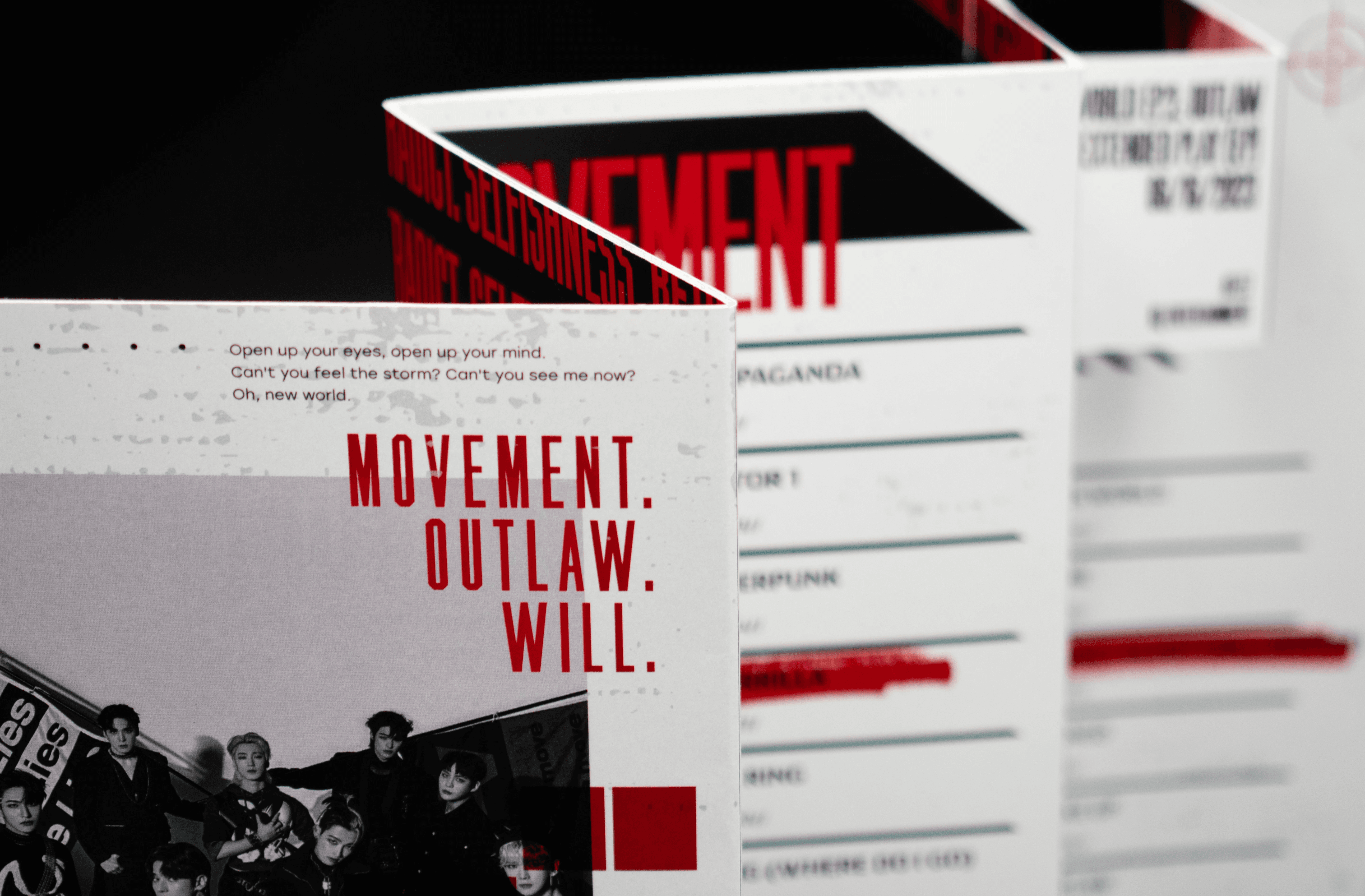

Inside this publication are the three albums that compose the trilogy: The World EP.1: Movement, The World EP.2: Outlaw, and The World EP.FIN: Will. Information to introduce these albums is laid out in the brochure, such as title, tracklists, song duration, and year of release.
To establish the setting of a dystopian universe, the brochure is methodically organized to convey the strict regime and allow the reader to skim the information with ease. Rougher textures and cyberpunk-esque graphics are applied to enhance the dark, defiant energy that the music evokes.
The back of the publication is designed using the introductory song of The World series, "PROPAGANDA". The entire lyrics of the song are employed to set the atmosphere of the story, and imagery of eyes from the actual band members are utilized to create an impactful message of surveillance and humanity.